Colour · 04.2
Gamut
The set of colours a device can actually produce is a shape, and converting between devices means deciding what to do with everything outside it.
In this entry
- What happens at the boundary
1 parts · Colour 04.2
Photo: RazorArt asset kit
Every device lives inside a boundary
A colour gamut is the complete set of colours a particular device can produce or capture — not the colours it is supposed to handle in principle, but the ones it can actually make. Plotted in a perceptually uniform colour space, that set forms a closed shape: a three-dimensional body that is convex for most output devices and noticeably irregular for most cameras and scanners. The shape matters because two devices almost never share the same one.
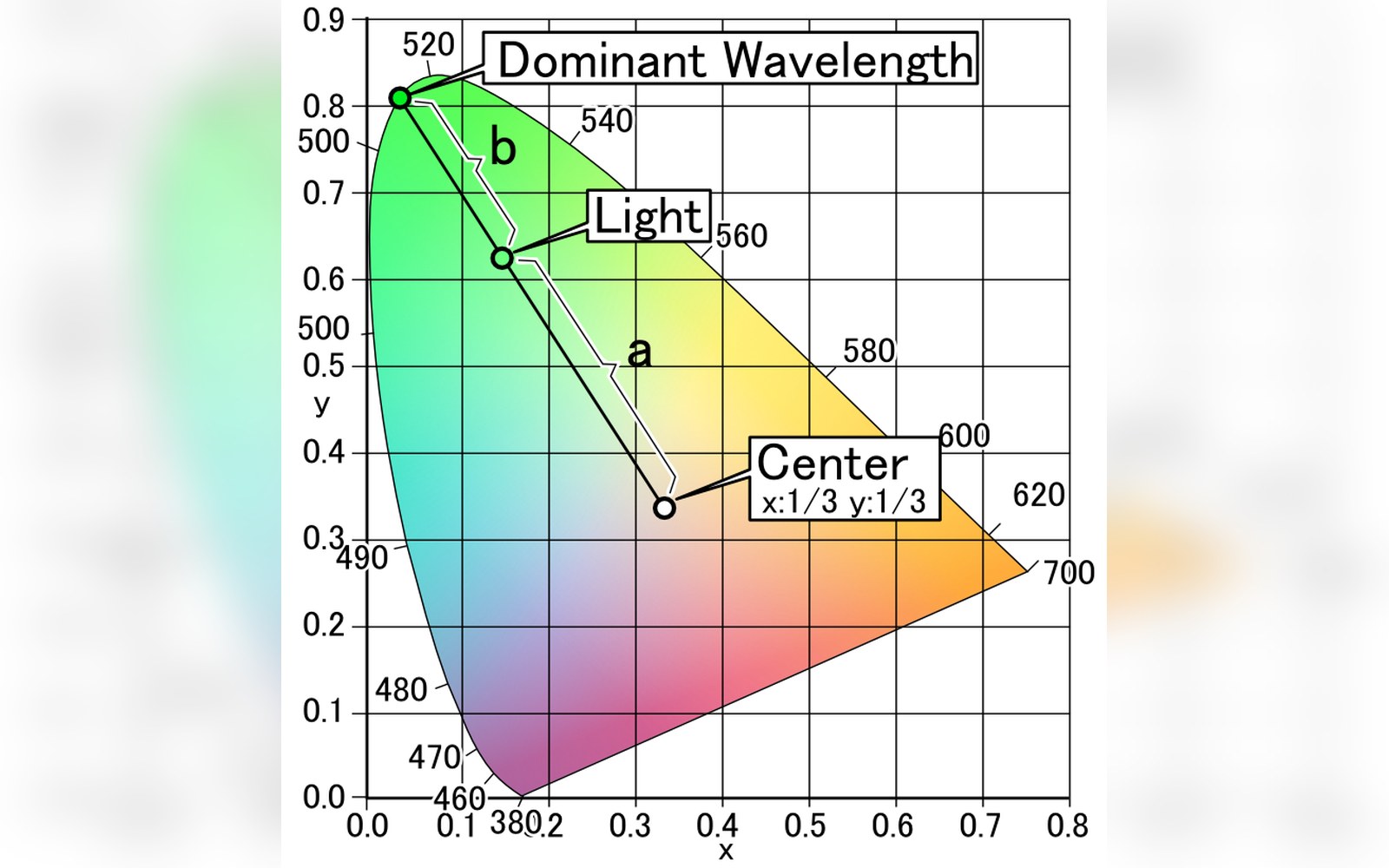
The word comes from the medieval Latin gamma ut, the bottom note of the musical scale, used by Guido d'Arezzo to name the full range of a voice. In colour science it migrated into its modern technical sense during the early twentieth century, when the Commission internationale de l'éclairage formalised the chromaticity diagram in 1931. The CIE 1931 diagram is still the standard backdrop against which device gamuts are drawn: the horseshoe-shaped region of all colours visible to a standard observer sits at the back, and every real device carves out a subset of it.

An RGB monitor produces colour by mixing three primaries — red, green and blue phosphors, LEDs or filtered backlights — and its gamut is the triangle those three primaries define on the chromaticity diagram. Move a primary outward toward the spectral locus and the triangle grows; move it inward and it shrinks. sRGB, standardised in 1996, was set to match the primaries typical of consumer CRT monitors of that era, and its triangle is modest. Display P3, developed for digital cinema and now common on wide-gamut screens, pushes the red primary significantly further, enclosing a larger area. Neither triangle covers the full horseshoe; saturated cyan and vivid green remain outside both.
A printer's gamut is a different shape altogether. Cyan, magenta and yellow inks subtract light rather than adding it, so the printed gamut is not a triangle but a lumpy solid that bulges in directions an RGB display cannot reach — some saturated cyans in print have no equivalent on screen — while falling short in others, particularly bright, fully saturated reds. This is why softproofing exists: you are simulating one solid with another, and the mismatches need to be made visible before ink hits paper.
The shape matters because two devices almost never share the same one.
What happens at the boundary
Colours that sit inside a device's gamut convert straightforwardly. Colours that fall outside it — out-of-gamut colours — have to be handled by a deliberate policy called a rendering intent. The International Color Consortium, which maintains the ICC profile specification, defines four standard intents, each encoding a different answer to the question of what to do with a colour the device cannot make.
Relative colorimetric rendering maps each out-of-gamut colour to the nearest point on the gamut boundary and leaves in-gamut colours unchanged; the result preserves accurate colours wherever it can but clips the rest, sometimes harshly. Perceptual rendering compresses the entire source gamut to fit inside the destination, so relationships between colours are maintained at the cost of shifting everything slightly — useful when the image contains many saturated colours that would otherwise clip. Saturation rendering sacrifices hue accuracy to preserve vividness, typically used in business graphics where a chart must look bold rather than look correct. Absolute colorimetric does not adapt the white point, so the source white is reproduced as it is, which matters when simulating one output on another.
None of these is a lossless operation. The choice of rendering intent is an editorial decision embedded inside the colour management system — inside the ICC profile that travels with a document or is attached to a device. Richard Shoup's SuperPaint system at Xerox PARC in the early 1970s operated with no such machinery: colours existed in whatever the framebuffer could encode and the monitor could fire. The machinery for describing and bridging gamut differences came later, as print and screen had to be reconciled and as the measurement science caught up with the engineering.
What has not changed is the underlying geometry. Every device you work with occupies a region of colour space, that region has edges, and the image you make will encounter those edges at some point in its journey from capture to output. Knowing the shape of those boundaries — and which policy governs what happens at them — is how colour moves from one device to another with any predictability at all.


Related in Colour