Colour · 04.1
RGB and CMYK
One adds light and the other subtracts it, and neither can describe the whole of what the other can.
In this entry
- Two different answers to the same question
- The geometry of what is missing
- How the arithmetic works
- From physics to pixel
4 parts · Colour 04.1

Photo: RazorArt asset kit
Two different answers to the same question
Colour on a screen is made from absence. A pixel begins dark, and three phosphors — or liquid-crystal cells backed by a white LED panel, or self-emitting diodes — add red, green and blue light until the eye reads the mixture as whatever hue was intended. Turn all three to full and the pixel goes white. This is additive colour, and it is the only model that can work when the display itself is the light source.
Colour on paper is made from presence. A white substrate already reflects everything; the inks exist to take wavelengths away, absorbing some portion of the spectrum at each layer. Cyan ink removes red. Magenta removes green. Yellow removes blue. Where all three overprint, so little light comes back that the result reads as black — in theory. In practice the absorption curves of real pigments are impure, and the three together produce a muddy brownish-grey rather than a clean neutral, which is why a fourth plate, K (for key, or simply black), was added to the process. That addition, and the four-letter name it gave the system, is at the heart of every printing workflow today.

The contrast between the two models is not cosmetic. Addition and subtraction obey different arithmetic, and the colour spaces they define cover different territories.
The geometry of what is missing
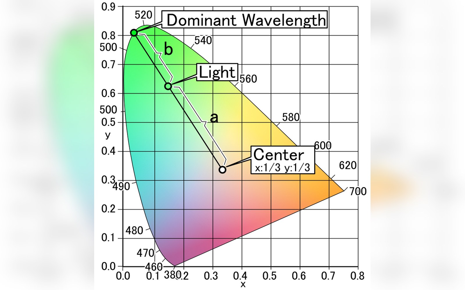
A colour space maps what a device or model can actually represent — its gamut. Plot the colours a calibrated monitor can produce inside the CIE 1931 chromaticity diagram and you get a triangle whose corners sit near the primaries: a red in the red-orange region, a green in the yellow-green, a blue near the violet edge. Everything inside that triangle is reachable by mixing those three emitters. Everything outside it — some saturated cyans, most spectral yellows, the deep reds of a printing ink — is simply absent from the screen's palette.
A printing process does something similar but differently shaped. The Commission internationale de l'éclairage defines colour measurement independently of any device, and when CMYK gamuts are plotted in that neutral space, their boundary does not coincide with the RGB boundary — it crosses it. Offset lithographic printing can hold certain saturated cyans and deep blues that a sRGB monitor cannot reproduce. The same monitor can show bright greens and yellows that would require special spot colours to print. Neither gamut contains the other. A colour that lives inside one may fall outside the other, and converting between them means making a judgment about what to sacrifice.
That judgment is called rendering intent. The International Color Consortium, which maintains the ICC profile format adopted across operating systems and applications, defines four standardised strategies: perceptual, which compresses the source gamut to fit the destination while preserving relationships; relative colorimetric, which clips out-of-gamut colours to the nearest reproducible point; saturation, which favours vividness over accuracy; and absolute colorimetric, which preserves the absolute colour values without white-point adaptation. Choosing among them is not an aesthetic preference in the casual sense — it is a decision about which properties of the original image are treated as essential.
How the arithmetic works
In an RGB system, each channel carries a value from 0 to 255 in an 8-bit implementation, or from 0 to 1 in the normalised floating-point form that colour science prefers. Adding the three channels in equal proportion at maximum gives white: (255, 255, 255) or (1, 1, 1). Black is (0, 0, 0). A pure red is (255, 0, 0). These numbers only make physical sense relative to a specified RGB colour space — sRGB, Display P3, Adobe RGB — because the same triplet describes a different absolute colour depending on where the primaries are placed and what transfer function (gamma curve) maps encoded values to actual luminance.
CMYK values work in ink coverage, expressed as percentages or as fractions from 0 to 1. 100% cyan, 0% magenta, 0% yellow, 0% black should absorb all the red light reaching the paper. Adding more channels does not add light; it takes away more of what the substrate reflects. The total ink coverage — C + M + Y + K — is bounded by what the paper and press can hold before ink bleeds or dries badly. This limit, called total ink limit or total area coverage, is typically set between 280% and 340% for coated stock, lower for newsprint. It has no analogue in RGB, where you can simply turn everything to maximum without any physical consequence.
This is additive colour, and it is the only model that can work when the display itself is the light source.
The conversion from RGB to CMYK is therefore not a clean mathematical inversion. It requires a choice about how to construct the K channel — how much black ink to use and how far to reduce the CMY inks to compensate. A strategy that favours heavy black use (UCR, undercolour removal) produces thinner ink layers and faster drying; one that keeps more colour ink (GCR, grey component replacement, at a different balance) can preserve neutral stability across press variations. These are decisions made inside the ICC profile or the RIP — the raster image processor that translates digital files into press-ready separations.
From physics to pixel
The RGB model's ancestry is in James Clerk Maxwell's 1861 demonstration that any colour can be approximated by mixing three primaries, and in the physiological discovery that the human retina carries three types of cone cell sensitive to overlapping broad bands of the spectrum. The practical engineering of three-channel display systems, from the shadow-mask CRT through to OLED panels, inherits that foundation directly.
The CMYK model's ancestry is in process colour printing, which uses halftone screens to simulate continuous tone from discrete ink dots. Frederic Ives developed practical halftone screening in the 1880s, and the four-colour separation process that followed made photographic reproduction in ink commercially viable. The K plate was standard in the industry long before any digital colour system existed.
What digital imaging added was the demand that the two models talk to each other constantly — a photograph captured in light must eventually become dots of ink, or a layout built for print must preview convincingly on a screen. The mathematics of that translation is the domain of colour management: ICC profiles encoding each device's behaviour, profile connection spaces providing a neutral reference, and rendering intents deciding what gets lost. The gap between what a monitor shows and what the press prints is not a failure of calibration alone. It is the consequence of two genuinely different physical processes, defined by different primaries, bounded by different gamuts, and governed by arithmetic that runs in opposite directions.

Related in Colour